
How I Created the Most Rad Border Effect Ever
Intro
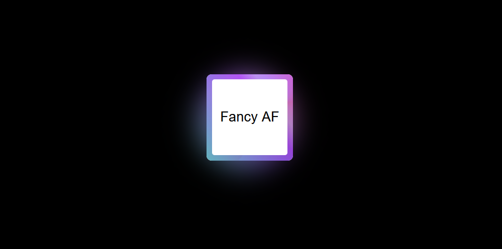
When it came to revamping my new website, I realized I’m not exactly a design virtuoso. Rather than attempting to turn my site into a neon-soaked cyberpunk extravaganza all at once, I decided to take it one retro-futuristic step at a time. And you know where I began? Crafting the snazziest border in the digital realm. Who needs to follow the “less is more” rule when you can dive headfirst into the “more is more” world of 80s-inspired design?
The Technique
Let’s unravel the mesmerizing technique behind this cyberpunk border masterpiece:
Overlay Everything: I started by overlaying elements like a true digital alchemist.
Colorful Borders: My journey began with making the border glow in colors that wouldn’t look out of place in a cyberpunk dystopia.
Inner and Outer Radii: I played with different inner and outer radii, creating a border that echoed the neon signs of a future cityscape.
Gradient Magic: Next, I dabbled in gradients, like weaving synthwave melodies into the code.
Multiple Gradients: Why settle for one gradient when you can layer on two or even three, creating a harmonious cyberpunk symphony?
Animation: No self-respecting digital neon sign stands still; it had to pulse and move.
Glow Effect: To make it truly stand out, I added a gentle, enticing glow, like the neon lights of an 80s arcade.
Hover Animation: And for that extra touch of interactivity, it kicked into high gear when hovered over, like an arcade game waiting for a quarter!
The Step-by-Step
Now, let’s break down the process with all the retro-futuristic flair:
- Start with a Simple Box: We began with a humble HTML box, a pixelated canvas ready to be transformed into something out of an 80s cyberpunk movie.
- Style It: With some basic styling, we gave the box structure, like setting the stage for a synthwave concert.
- Experiment with Gradients: To achieve that retro-futuristic neon glow, we started experimenting with gradients, like tweaking the color palette of a digital skyline.
- Add More Gradients: One gradient wasn’t enough. We layered on another, like blending two 80s tracks together on a neon-lit dance floor. Why stop at two? A third gradient joined the party, like adding another layer to a synth track for that extra oomph.
- Combine Them All: The magic happened when we combined them all at once, creating a visual masterpiece that could rival any 80s album cover. The result was an incredibly cool gradient, like a neon sign beckoning you to explore the virtual night.
Intermission
Here’s a cool trick: if you’re satisfied with a gradient border, you can essentially stop at this point. By overlaying a few white gradients (or gradients matching your site’s background color), you can create the illusion of a border, like the glow of a distant synthwave cityscape.
But our goal wasn’t just a border; we aimed for more!
Moving Parts
- Rotation: To achieve a dynamic, rotating effect, we safely positioned it in a pseudo-element, like the spinning gears of a cyberpunk machine.
- Spin Animation: We crafted a spin animation for added flair, like the ever-moving energy of a retro arcade.
- Scaling: Adjustments were made to ensure the background filled the container seamlessly, like fine-tuning the size of an iconic DeLorean mini to be used as a movie prop.
- Hide Overflow: We kept it clean by hiding any overflow, maintaining the sleek, minimalist look of a cyberpunk console.
Foreground Magic
- :after Pseudo-Element: The foreground was made to match the background of our page, and for a polished look, we rounded out the corners, like giving a touch of elegance to a dystopian cityscape.
The Grand Finale
Neon Glow: The pièce de résistance was to create a neon-like effect with a gradient shadow, like the glowing signage of a cyberpunk alley.
Shadowed Box: To elevate the effect, we encapsulated it in a shadowed box element, like framing a work of art in a dimly lit gallery.
- Spin Again: A second spin animation was added, this time without scaling, like the spinning reels of a futuristic slot machine.
- Blur and Opacity: To achieve a convincing shadow effect, we blurred it slightly, adjusted opacity, size, and position, like tweaking the settings of a cyberpunk hologram.
And There You Have It
The result? The fanciest border in the digital cyberpunk world, ready to make your web design truly spectacular, as if plucked from the neon-drenched streets of the 80s!
Here is a codepen with all the versions, so you can play around with it: