
How I Created the Most Rad Border Effect Ever
Intro
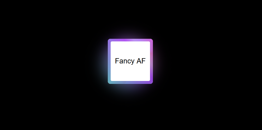
When redesigning my website, I realized I’m not exactly a design expert. Rather than overhauling everything at once, I decided to take it one step at a time. Inspired by neon-lit cyberpunk aesthetics, I started with something simple but eye-catching: an animated gradient border. Sometimes “more is more” can be the right approach, especially when you’re going for that retro-futuristic vibe.
The Technique
Here’s the technique behind this animated border effect:
Overlay Elements: Start by layering multiple elements on top of each other.
Colorful Gradients: Create vibrant, multi-colored gradients for visual interest.
Border Radii: Use different inner and outer radii to shape the border.
Multiple Gradient Layers: Layer two or three gradients together for a richer effect.
Animation: Add rotation to create movement and visual interest.
Glow Effect: Apply a soft glow to make the border stand out.
Hover Animation: Include an interactive state that responds when users hover over it.
The Step-by-Step
Now, let’s break down the process:
- Start with a Simple Box: We begin with a basic HTML element.
- Style It: Add some basic CSS to give the element structure and dimensions.
- Experiment with Gradients: Start experimenting with CSS gradients to create colorful effects.
- Add More Gradients: One gradient isn’t enough. Layer on a second gradient, and then a third for added depth and complexity.
- Combine Them All: Combine all the gradients together to create a rich, multi-layered visual effect.
Intermission
Here’s a useful tip: if you’re happy with just a gradient border, you can stop at this point. By overlaying gradients that match your site’s background color, you can create the illusion of a border.
But we’re going for more than just a static border!
Moving Parts
- Rotation: To create a rotating effect, position the gradient in a pseudo-element.
- Spin Animation: Add a CSS rotation animation to create continuous movement.
- Scaling: Adjust the background size to ensure it fills the container seamlessly.
- Hide Overflow: Use
overflow: hiddento keep the effect contained within the element bounds.
Foreground Layer
- :after Pseudo-Element: Create a foreground layer that matches your page’s background color and add rounded corners for a polished look.
The Finishing Touches
Glow Effect: Create a glowing effect by adding a gradient-based shadow beneath the border.
Shadow Layer: Add a container element with a shadow to give the border more depth.
- Second Rotation: Add another rotation animation to the shadow layer, this time without scaling.
- Blur and Opacity: Apply a blur filter and adjust the opacity, size, and position to create a realistic shadow effect.
Final Result
And there you have it! An animated gradient border with a glowing effect that captures that neon cyberpunk aesthetic while adding serious visual interest to your web design. Whether you’re going for full-on 80s retro-futuristic vibes or just want something that stands out, this technique delivers.
Here’s a CodePen with all the versions so you can experiment with it: